


Why you should ditch the slideshow plus 5 other design alternatives to consider
Slideshows have been around as a standard home page design element for a long time now. They have been super popular but are they actually effective?
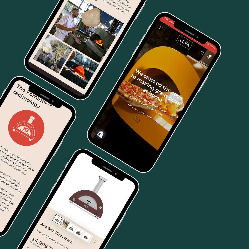
The hero or banner section of your website is very important on your website home page. It's a place where you can direct your customers to your site goals when they visit your site - it maybe to view a collection of products, make an inquiry or booking, download a document or promote an event.
Many clients want slideshows on their sites for these reasons:
- So many other websites use slideshows, so we also want to have one
- A slideshow carousel can display a lot of content in the same amount of screen space
- They look cool with moving pictures or other animations
Why are slideshows bad?
- Most website visitors will only take action only on the first slide. Is a visitor to your website going to wait patiently for all 6 of your slides to be displayed - probably not. They'll scan the first one and then scroll down your website.
- Slideshows can be distracting and/or annoying especially if there is a lot of animation going on
- Slideshows can be bad for SEO if the correct header tags aren't used
- Slideshows can slow down your site particularly on mobile. High res images can cause pages to be slow to load on desktop and mobile. This can in turn affect SEO as well.
Consider these best practices if you do want to use a slideshow
- Have the first slide show by default and don't set your slideshow to auto-rotate. Let visitors navigate through your other slides if they want to.
- Only add a maximum of 3 slides and make sure the images you use are well optimised to web. Test the load speed of your site.
- make sure your slideshow text has the correct html tags for SEO.
Here are 5 alternatives to slideshows that you could implement on your website home page
1) Single Hero Image
Having one stand alone perfect image that represents your brand or business on your home page, with a catchy headline and clear call to action.
Example site: https://www.ikea.com/
2) Image Grid or Collage
This will allow you to include more images without adding a slideshow. Make the images clickable and add call to action links or buttons. There are many grid design options you could implement.
Example site: https://www.theiconic.co.nz/
3) Engaging Video or Animated Hero
This needs to be considered from a marketing point of view not a 'coolness' point of view. A video may represent your brand better than a single image can.
Example site: https://thebold.nz
4) Create additional landing pages
You could make other pages of your website more focused landing pages so that you don't feel like you have to include all the information on your home page. Maybe your core services each have their own landing page or your main product categories are turned into detailed landing pages.
Example site: http://www.rebelsport.co.nz/clothing.htm
5) Take a direct approach
Maybe you just go straight into your headline, intro and call to action directly. This out of the comfort zone for most but if done well can be very effective.
Example site: https://www.shopify.com
Once you start taking a look around at other sites, in particular big brand sites, you'll soon notice that slideshows are rarely used on their home pages. Maybe it's time for a change on your website too...
If you need any help redesigning your Shopify site home page, feel free to get in touch, we'd love to help!